Folks,
John Doe, member of the ground breaking punk band X, released a superb solo album in 1995, “Kissing So Hard”. By that time, Mr. Doe had evolved into a country-punk artist and the sixth track “Kissing (So Hard)” proved that he was as much poet as musician.
What does all this got to do with our work in new product industrialization? If you ever attended a X concert, you left drained, sweaty and with bleeding ears. Often, when we’re “getting color right” we leave drained, sweaty and with bleeding eyes…
Why is “Color So Hard”? Well, for many reasons: there are countless colors and infinite shades to match; there’s no standard language to accurately describe color; color reference books differ slightly from one print run to the next and can fade with time and storage conditions; and most significantly, everyone perceives color a bit differently. All of this makes arriving at the perfect color really hard.
So, how to improve the process:
1. Do Start with the Same Pantone Book
Pantone produces many variations of their books: Formula Guides; Color Bridge Guide-coated and uncoated; Extended Gamut Guide; Pastels & Neons; Metallics Guide; and more.
As we’re usually matching several different materials that will be combined into one product, it doesn’t matter so much which standard we start with, so long as all parties are using the same book. And as mentioned above, everyone involved should use books from the same print run.
2. Don’t Try to Match Color on Electronic Displays
Trying to arrive at a color consensus by looking at displays or screens in multiple locations is a waste of time. And never try this on your phone.
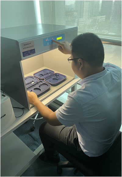
Even when using calibrated electronic displays, the background lighting, angle at which you view the screen and the vision correction of the viewers all conspire to defeat effective color matching. You really need to have the samples in hand to make this productive.
A much better approach is to use a calibrated light cabinets. We have the cabinets in all of our offices and use portable versions when we visit our supply partners.
These boxes allow side-by-side comparison of color variations and materials and eliminates the lighting variables found when using informal methods.
3. Do Box the Preferred Color
As much as you’re set on a particular shade of sage or Celedon green, it may be impossible to hit the target due to manufacturing constraints (more on this below).
A good strategy is to “box the preferred color” and provide the team with a range five or six shades or tones that are slightly warmer/cooler or brighter/dimmer than the specified color. That will take the handcuffs off the development team (suppliers of pigments, decorative coatings, anodizers, molders, painters, etc.) and land on a tone that’s feasible and can be reproduced.
4. Don’t Use the Language(s) of Color
While “make it bluer”, “warm it up” and “go more optic” is code for “you missed the color target, please spin out a new round of color samples”, these phrases don’t offer us clear path forward. Add in the cultural and language differences that exist in international sourcing, this becomes really complicated. And reference #3 above.
5. Do Use Materials and Finishes that Will be Utilized in Production
Color samples that are printed on paper (or somewhat better, molded plastic color chips) are a poor proxy for how color will appear on your finished product. The surface finish of production materials impacts color perception in a big way.
- Substrates including corrugated packaging, dyed and printed fabrics, diecast and extruded metal alloys, molded plastic, sheet metal, etc. that are used to fabricate hardware are a major contributor to how colors are perceived.
- Surface finishes such as the EN Designation or ASTM Equivalent for metals, MT (Mold Texture) for molded plastics and weave profile for fabrics all strongly influence how the colors will be perceived.
When we’re working under the conditions summarized here, we expect approximately two rounds of sampling to get color right. Without those tools, this process can generate some colorful language.
Cheers,
Jack Daniels
+1.617.285.2486